Buzz Haven: Your Source for Trending Insights
Stay updated with the latest buzz in news, trends, and lifestyle.
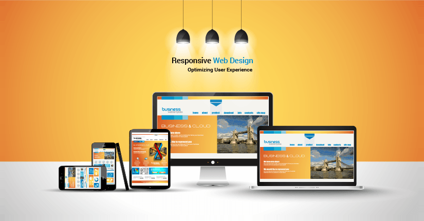
Responsive Web Design: When Pixels Go on a Diet
Transform your website with responsive design! Discover how to slim down your pixels and boost user experience for any device.
Understanding Breakpoints: The Key to Responsive Design
Understanding breakpoints is essential for creating responsive designs that adapt seamlessly to various screen sizes and devices. A breakpoint is a specific point at which a website's layout changes to provide an optimal viewing experience. By incorporating breakpoints into your design strategy, you can ensure that your website looks great and functions well on smartphones, tablets, and desktop computers alike. This adaptability not only enhances user experience but also boosts your site's search engine optimization (SEO) performance, as search engines favor mobile-friendly designs.
To effectively implement breakpoints, consider these essential tips:
- Identify the most common screen sizes your audience uses and establish breakpoints accordingly.
- Utilize CSS media queries to apply different styles at each breakpoint, ensuring your content remains accessible and visually appealing.
- Test your design on multiple devices and screen sizes to verify that all breakpoints work as intended.

The Benefits of Fluid Grids in Responsive Web Design
In today's digital landscape, responsive web design is more crucial than ever, and one of its key components is the use of fluid grids. Unlike traditional fixed-width layouts, fluid grids allow web elements to resize and adapt to the screen size of any device. This means your website will offer an optimal viewing experience whether accessed on a smartphone, tablet, or desktop. By employing fluid grids, designers can create a seamless transition between different screen sizes, which not only enhances user experience but also boosts your site's search engine ranking as responsiveness is a vital SEO factor.
Additionally, fluid grids facilitate better resource allocation and management across various devices. This layout flexibility helps to maintain visual consistency and usability, which are critical for retaining visitors. As a result, businesses can achieve higher conversion rates and reduced bounce rates. Furthermore, implementing fluid grids can simplify the design process by allowing designers to focus on content rather than fixed dimensions. Overall, embracing fluid grids in your responsive web design strategy provides significant advantages that enhance both functionality and aesthetics.
How to Optimize Images for a Responsive Experience
Optimizing images for a responsive experience is crucial in today's web design landscape. Start by choosing the right file format; use JPEG for photographs, PNG for images with transparency, and SVG for logos and icons. Additionally, it's essential to resize your images to the appropriate dimensions based on where they will be displayed. Use CSS media queries to serve different image sizes to different devices, ensuring that you deliver the right resolution without compromising load speed.
Another vital aspect of image optimization is compression. Tools such as ImageOptim or TinyPNG can significantly reduce file sizes without noticeable quality loss. Implementing srcset attributes in your <img> tags will help browsers select the best-suited image for the user's device. Finally, don't forget to include descriptive alt text for accessibility and SEO, making your content not just visually appealing but also search engine friendly.