Buzz Haven: Your Source for Trending Insights
Stay updated with the latest buzz in news, trends, and lifestyle.
Color Me Impressed: Choosing the Perfect Website Palette
Discover how to transform your website with the perfect color palette! Unlock design secrets that captivate and convert visitors.
The Psychology of Color: How to Choose the Right Palette for Your Website
Understanding the psychology of color is crucial for creating a visually appealing website that resonates with your target audience. Different colors evoke distinct emotions and associations; for instance, blue often conveys trust and professionalism, making it a popular choice for corporate websites. On the other hand, warmer colors like red and orange can invoke feelings of excitement and urgency, suitable for e-commerce platforms aiming to drive conversions. Therefore, when choosing your website's color palette, consider the emotional responses you want to elicit from visitors and how those emotions align with your brand identity.
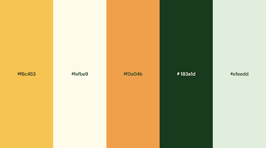
When developing your site's color scheme, it's also essential to think about color harmony. Utilizing complementary, analogous, or triadic color schemes can create a visually balanced and aesthetically pleasing look. For example, a combination of blue and orange can create a striking contrast, while shades of green and yellow can provide a sense of calm and harmony. Additionally, be mindful of accessibility; ensure that your color choices maintain readability, especially for users with visual impairments. Remember, the right color palette not only enhances your website's appearance but also strengthens your brand's message and user experience.

10 Tips for Creating a Cohesive Color Scheme for Your Brand
Creating a cohesive color scheme for your brand is essential for establishing a strong visual identity. Start by understanding your brand's personality; whether it’s playful, professional, or innovative, your color choices should reflect this. Consider using a color wheel to help you select colors that complement each other. For example, you can use analogous colors (colors that are next to each other on the wheel) for a harmonious look, or complementary colors for a vibrant contrast.
Next, it’s vital to limit your color palette to three to five colors. This ensures clarity and consistency across all your branding materials. Use your primary color for key elements like your logo, and secondary colors to support your designs. To keep things organized, create a style guide that outlines how and where to use each color. By following these tips, you'll be well on your way to developing a cohesive color scheme that resonates with your audience and strengthens your brand's identity.
What Are the Best Color Combinations for Effective Website Design?
Choosing the right color combinations for your website design is crucial for creating an engaging user experience and enhancing your brand identity. Effective color schemes not only communicate your brand's message but also evoke specific emotions in your audience. For instance, blue often conveys trust and professionalism, making it a popular choice for corporate sites. On the other hand, bright colors like orange and yellow can evoke feelings of excitement and friendliness, ideal for brands targeting younger demographics. Here are some popular combinations you can consider:
- Blue and White - Classic and clean, great for professionalism.
- Black, White, and Gold - Luxurious and elegant.
- Green and Brown - Earthy and organic, perfect for eco-friendly brands.
In addition to understanding the emotions behind colors, audience expectations also play a significant role in effective website design. Different industries may necessitate varying color approaches. For example, fitness websites often incorporate vibrant colors like red and green to energize users, while healthcare sites tend to use softer hues like pastel blues and greens to inspire calmness and trust. When selecting your palette, consider testing various combinations through A/B testing to see how they resonate with your audience. Remember, the ultimate goal is to create visual harmony that not only engages visitors but also guides them toward taking desired actions.