Buzz Haven: Your Source for Trending Insights
Stay updated with the latest buzz in news, trends, and lifestyle.
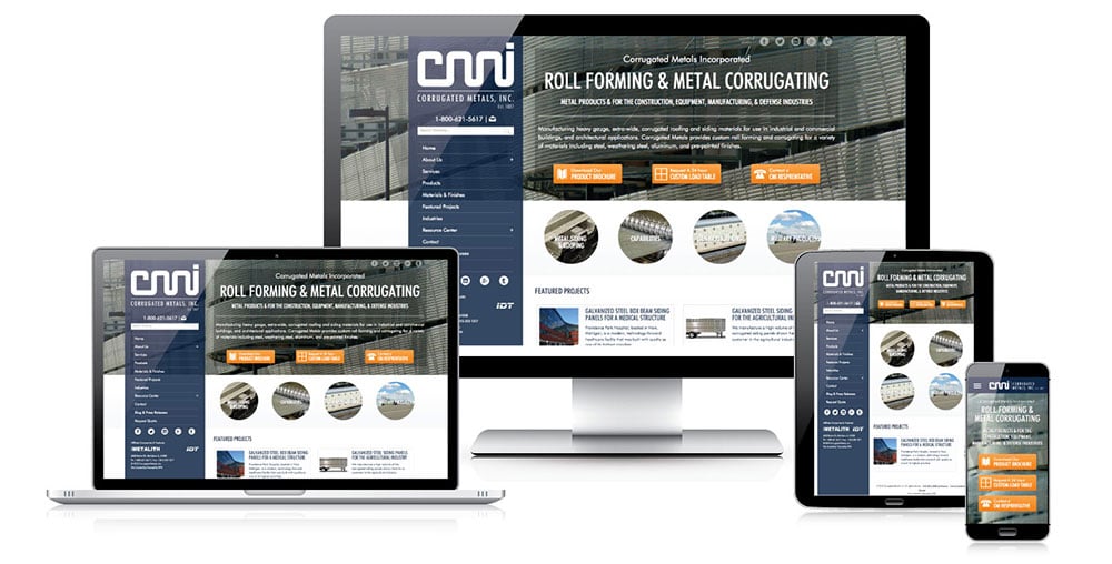
Responsive Web Design: Where Your Website Meets Every Screen
Transform your website with responsive web design—ensuring stunning visuals on every screen! Discover the secrets to captivating your audience.
The Essentials of Responsive Web Design: A Complete Guide
Responsive web design is a crucial aspect of modern web development that ensures websites provide an optimal viewing experience across a wide range of devices, from desktops to smartphones. By utilizing fluid grids, flexible images, and media queries, designers can create layouts that adjust seamlessly to different screen sizes. This approach not only enhances user experience but also boosts a website's SEO performance, as search engines prioritize mobile-friendly designs. To get started, developers should focus on mastering the fundamental principles of responsive design, including:
- Implementing a mobile-first design strategy
- Using CSS frameworks like Bootstrap or Foundation
- Testing across multiple devices and browsers
In addition to technical implementation, understanding the user experience is essential for effective responsive web design. Designers must consider how content is displayed and interacted with, ensuring that navigation is intuitive and accessible across all formats. This involves prioritizing key content, optimizing loading speeds, and sometimes simplifying the layout for smaller screens. A successful responsive design not only increases user engagement but also contributes to higher conversion rates. Ultimately, staying updated with evolving trends and best practices in responsive web design is vital for maintaining a competitive edge in the digital landscape.

Top 5 Benefits of Responsive Web Design for Your Business
Responsive web design is essential for businesses looking to enhance their online presence. One of the primary benefits is improved user experience across various devices. With more users accessing websites via smartphones and tablets, a responsive design ensures that your site adapts seamlessly to different screen sizes. This adaptability not only makes navigation easier but also keeps visitors engaged, reducing bounce rates and increasing the likelihood of conversions.
Another significant advantage of responsive web design is its positive impact on SEO. Search engines like Google prioritize mobile-friendly websites in their search results. By employing a responsive design, your site can enhance its visibility on search engines, driving more organic traffic. Additionally, managing a single responsive website is more efficient than maintaining separate desktop and mobile versions, saving time and resources while contributing to a better overall user experience.
How to Test Your Website's Responsiveness Across Different Devices
Testing your website's responsiveness is crucial in today's multi-device world. To begin, use responsive design testing tools such as Google's Mobile-Friendly Test, which evaluates how well your site performs on mobile devices. Additionally, you can employ browser developer tools by right-clicking on your webpage and selecting 'Inspect'. From there, utilize the 'Toggle device toolbar' option to simulate various screen sizes. This method allows you to check not only the layout but also the functionality of interactive elements across devices.
After checking with these tools, it’s important to conduct real-world testing on actual devices. Gather a range of devices—tablets, smartphones, and desktops—to see how your website displays. Make a checklist that includes the following items:
- Text readability and size
- Image scaling
- Button accessibility
- Navigation ease