Buzz Haven: Your Daily Dose of News
Stay informed and entertained with the latest buzz in news, trends, and insights.
Web Typography: Where Style Meets Readability
Discover the perfect blend of style and readability in web typography. Transform your text and captivate your audience like never before!
The Essential Principles of Web Typography: Balancing Aesthetics and Functionality
Web typography is a critical component of effective web design, where balancing aesthetics and functionality can significantly impact user experience. The choice of typeface, font size, and line spacing all contribute to how content is perceived. A well-chosen typeface not only enhances visual appeal but also increases readability, making it easier for users to consume information. To achieve this balance, consider employing a hierarchy in your typography, using different font weights and sizes to guide the reader's eye through the content.
Furthermore, optimizing web typography involves considering responsive design. This means ensuring that your text remains legible across various devices and screen sizes. Implementing relative units like em and rem can help maintain proportional sizing. Additionally, paying attention to contrast between text and background color is essential for visibility. By applying these principles, you can create an engaging reading experience that captivates your audience while maintaining functionality.

How to Choose the Right Fonts for Your Website: A Beginner's Guide
Choosing the right fonts for your website is crucial, as it can significantly impact your site's overall aesthetic and usability. Start by considering the overall tone and purpose of your website. For example, a clean and modern sans-serif font may be appropriate for a tech blog, while a more traditional serif font might be ideal for a law firm. It's essential to maintain consistency across different elements of your site, so aim to select two to three fonts that complement each other and resonate with your brand identity.
Another important factor to consider is readability. Ensure that your chosen fonts are easy to read on various devices and screen sizes. To enhance user experience, you can use tools like the Google Fonts library, which offers a wide range of web-friendly fonts. Additionally, pay attention to font size and spacing; using appropriate line height and letter spacing can make a significant difference in text legibility. Keep in mind that less is more—limiting the number of different fonts can create a cohesive and professional look for your website.
What Makes Typography Effective in Web Design? Key Elements to Consider
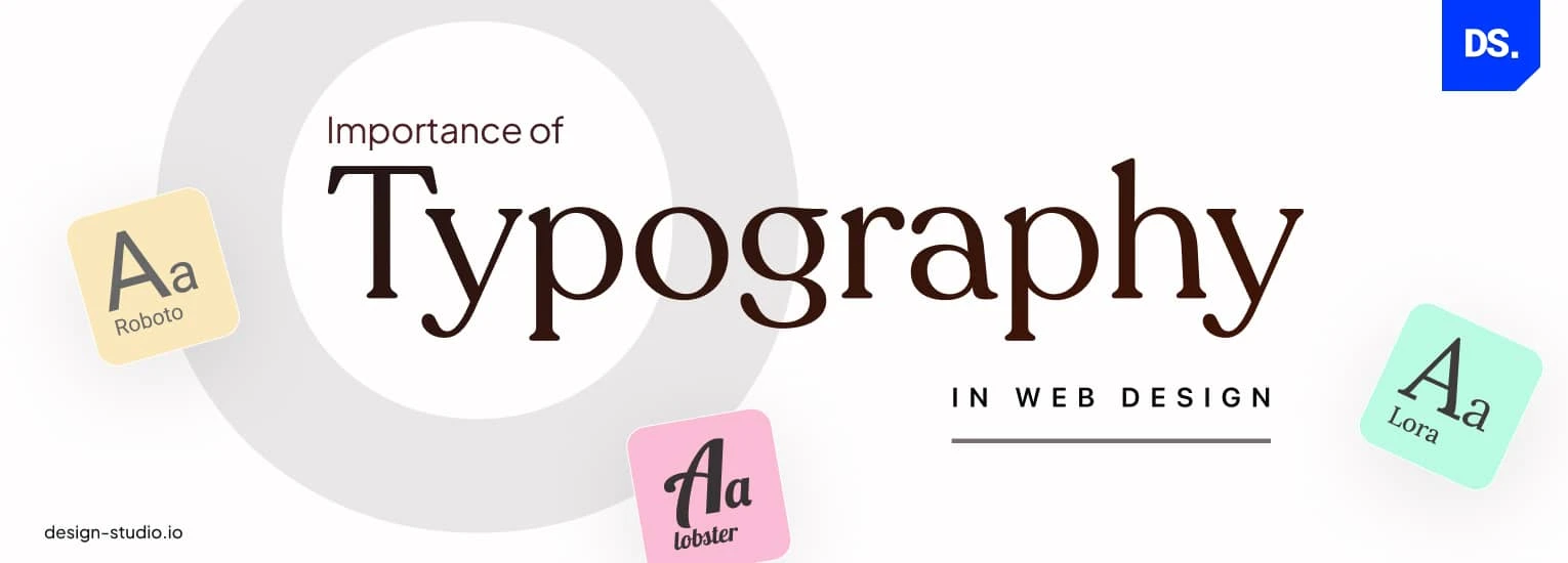
Typography plays a crucial role in web design, influencing how users perceive and interact with content. Effective typography grabs attention, guides the reader through the page, and enhances readability. Several key elements contribute to the effectiveness of typography, including font choice, size, and spacing. Choosing the right font that aligns with the brand's voice creates a cohesive experience. It is advisable to limit font styles to a maximum of two or three to maintain visual harmony. Moreover, font size should cater to accessibility; generally, a minimum of 16 pixels is recommended for body text to ensure comfortable reading across devices.
Another critical factor is line length and line height, which both impact the overall readability of text. Ideally, lines should not exceed 75-100 characters to reduce eye strain and promote easier tracking from line to line. Adequate line height, often 1.5 times the font size, creates breathing space, making it easier for readers to absorb information. Additionally, utilizing contrast between text and background is essential; high contrast enhances legibility, while low contrast can cause strain and hinder comprehension. Ultimately, effective typography in web design is about creating a harmonious visual hierarchy that not only attracts but retains users’ attention.